UI UX design services that turnclicks into customers.
We design product interfaces, design systems, and developer-ready Figma files for teams building web apps, mobile apps, and SaaS products. Research-backed UX, component-based systems, and handoff files engineers can actually build from — not mood boards that break in sprint one.
The reasons clients pick us, in their own words. Each one is something most agencies will swear they do — and most don't.
Research01
Decisions backed by users.
Design without research is decoration. Every flow we design is grounded in user interviews, competitor analysis, and jobs-to-be-done thinking before a single pixel is placed.
Systems02
A design system that devs love.
Inconsistent UI slows engineering and frustrates users. We build component libraries in Figma with tokens, variants, and Dev Mode specs that engineers can build from without a single Slack message.
B2B03
B2B UI that closes deals.
Enterprise buyers judge product quality by interface quality before they sign. Clean, dense, data-rich UI that signals maturity and builds trust in the first sales demo.
Handoff04
Files and systems. All yours.
Your Figma file, your component library, your design tokens. Full handover with documentation. No vendor lock-in to our tools or our team.
VOICES
What founders say on the record.
Verified feedback from Upwork, Clutch, and reference calls we're happy to set up before you sign anything.
Evan Kanouse
CEO, Modestly
Entalogics has successfully delivered extension prototypes on time, and we are impressed with their project management and the finished product. The client communicates with Entalogics via virtual meetings, email, and messaging apps.
Adam Strock
Founder, Flourish Schools
Collaborating with Entalogics was a great experience. Communication was clear, we aligned quickly, and their team delivered high-quality code on time with thoughtful technical decisions.
Giles Whitman
CTO, SentryBay
Their Chromium expertise helped us ship a hardened browser with live threat controls and enterprise rollout support. Security operations became significantly faster.
George Irvin
Founder, G3 Ventures LLC
Entalogics delivered our custom Electron browser in six months with isolated profile workflows and stable policy sync. Agent onboarding improved by 55% after rollout.
Dani Keo
Project Manager, Sociall
Entalogics built our iOS Chromium-based mobile app with a smooth native feel, stable media rendering, and reliable sync. We shipped faster and improved engagement after launch.
Project Manager
RozmeriGPT
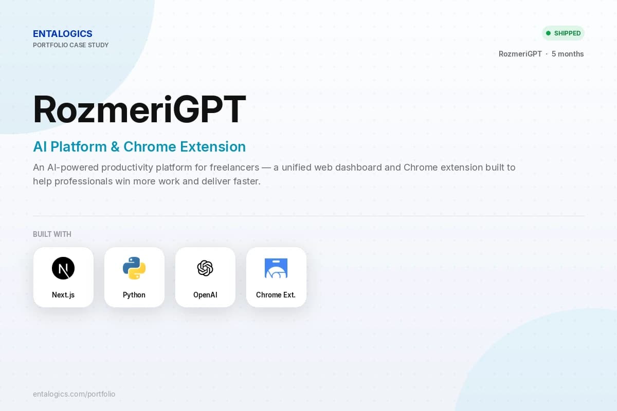
The web dashboard and Chrome extension now share prompts, billing, and analytics in one platform. Our content turnaround improved 4x after launch.
Ilya Khodakovsky
Project Manager, Omni Browser
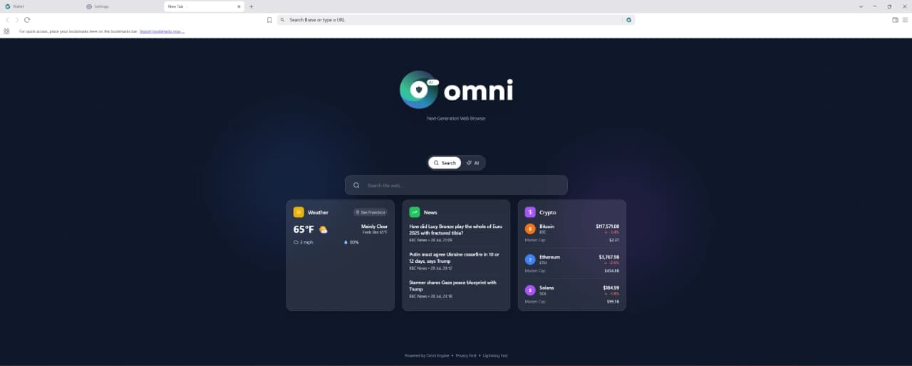
Entalogics built our Omni Browser on top of Chromium with deep product-level execution. They implemented an integrated VPN and Omni Crypto Wallet directly in the browser, made strong architectural decisions, and delivered quality code on schedule with clear communication.
Sherzod Khabibullayev
Project Manager, Digital Office: Aura
Entalogics built Digital Office: Aura as a custom Chromium-based authentication platform. Their team modified Chromium internals and integrated our manual custom authentication flow with reliable implementation, fast delivery, and consistent communication.
Design is a revenue problem, not an aesthetic one.
Bad design destroys revenue at every stage of the funnel. Here is where it shows up first.
94%
Acquisition
Of first impressions are design-related. Visitors judge credibility before they read a word.
#1
Activation
Poor onboarding UX is the number one reason users never reach their first value moment.
3×
Retention
Users who struggle with UI churn 3× faster than users who find the product intuitive from day one.
0
Referral
Nobody recommends a product they find hard to use, regardless of how powerful it is.
1st
Revenue
Enterprise buyers judge product maturity by interface quality before they agree to a demo.
✓
Design is not a line item. It is the multiplier on everything else you build.
The real cost
What bad design actually costs.
Design buyers often think design is optional or can be done cheaply. These are the costs we see when product design is treated as decoration.
01
✗
Users drop off in the first 10 seconds
The value proposition is not clear above the fold — no second chance at a first impression.
02
✗
Onboarding abandonment
The first-use experience asks too much too soon — activation rate never recovers without a full redesign.
03
✗
Support tickets flooding in
Users cannot find basic features — design debt creating direct operational cost every month.
04
✗
Engineering time wasted on rework
Components get redesigned three weeks later — no design system means every sprint has rework baked in.
05
✗
App Store and Play Store reviews citing confusing UI
Public, permanent, and damaging to organic discovery and conversion.
06
✗
Full rebrand needed 18 months after launch
No design system was built — costs three times more than doing it right the first time.
✓
We design for conversion, clarity, and engineering handoff from week one — so design debt does not compound into churn, support load, and expensive redesigns.
Honest fit
What we design. What we don't.
We are product designers, not a full-service creative agency. Here is exactly where we work.
✓We design
✓Product interfaces — web apps, mobile apps, and desktop applications
✓Design systems and component libraries built for engineering teams
✓Marketing and landing pages optimised for conversion
✓Onboarding flows, empty states, and error handling
✓Data visualisation and complex dashboard UI
✓Accessibility-compliant interfaces meeting WCAG 2.1 AA
×We don't
×Logo and brand identity from scratch — that is brand design, not product design
×Print materials — brochures, business cards, or posters
×Standalone illustration and custom iconography projects
×Motion graphics and video production
×Figma templates with no product context
×Marketing campaigns and ad creative
Design systems
What a design system actually contains.
Most teams think a design system is a Figma file with some colors and fonts. Here is what we actually deliver.
Foundations
Design tokens
Color palette (light + dark)
Typography scale
Spacing system
Border radius
Shadow levels
Motion timing
Components
Buttons (all states)
Form inputs
Modals and drawers
Navigation patterns
Data tables
Empty states
Loading states
Error states
Toast notifications
Patterns
Onboarding flows
Authentication screens
Settings pages
Dashboard layouts
Data entry forms
Confirmation dialogs
Search and filter UI
Documentation
Component usage guidelines
Do and don't examples
Accessibility notes per component
Token naming conventions
Contribution guidelines for engineers
Version changelog
What we deliver
Six design engagements, one design bench.
The shapes of product design work we take on most often — from zero-to-one products to design systems and research-led iteration.
#
ENGAGEMENT
WHAT IT IS
01
Product design from zero
Full design system, information architecture, user flows, and high-fidelity screens for a product that does not exist yet.
02
Redesign of an existing product
Audit, redesign, and systematise a product that has grown messy, inconsistent, and hard to use.
03
Design system creation
Component library, tokens, documentation, and Figma file your engineering team can build from immediately.
04
Landing page and marketing design
Conversion-focused design with clear hierarchy, social proof placement, and CTA architecture.
05
User research and usability testing
Interviews, usability sessions, heatmap analysis, synthesised into prioritised design decisions.
06
Design-to-code handoff
Figma files structured for Dev Mode with specs, tokens, breakpoints, and component notes.
Engagement shape
From brief to shipped in four phases.
A typical product design engagement — research and wireframes before pixels, accessibility before handoff, design QA through build.
W01–02
Discovery & research
User interviews, competitor analysis, jobs-to-be-done mapping, information architecture, design principles agreed.
W02–04
Wireframes & flows
Low-fidelity wireframes for every core flow, user journey diagrams, interaction logic, stakeholder alignment before high-fidelity begins.
W04–10
High-fidelity design
Design system built, component library in Figma, all screens designed at high fidelity across responsive breakpoints, accessibility review completed.
W10+
Handoff & support
Figma Dev Mode handoff, design tokens exported, design QA during engineering build, iteration on developer feedback, final sign-off before launch.
Tools
Design tools. Used properly.
Figma-first product design with research, prototyping, and handoff tooling chosen for product teams — not a generic creative stack.
UX is how the product works — research, flows, information architecture, and usability. UI is how it looks and feels — typography, colour, components, and visual hierarchy. We do both as one product design practice.
Yes — every engagement ends with Figma files structured for Dev Mode, design tokens, responsive specs, and component notes. Engineers build without guessing.
Yes — we audit what you have, systematise what works, and redesign what doesn't. Most redesigns include a design system so inconsistency does not return.
Research is part of every engagement — interviews, usability testing, competitor analysis, and synthesis into prioritised design decisions. Screens without research are not what we sell.
A focused product design sprint: 4–8 weeks. Full product from zero with design system: 8–12 weeks. Ongoing embedded design scales with your sprint cadence.
Both — but we always recommend a design system for products with more than a handful of screens. Tokens, components, and documentation are standard on every handoff.
Senior engineers
Start your design projectthis quarter.
Free 30-minute call with a senior product designer. By the end you'll have a scoped approach, timeline, and handoff plan — whether you hire us or not.